Correlation between COVID-19 per capita death rates and population density for US states
We had a Zoom session with a friend yesterday as I was showing him around the Wolfram Language, and one of the questions we discussed is whether there is a correlation between death rate per capita and population density for US states. We could hypothesize that there should be one, In essence, higher population density means higher rates of infection, regardless of what the official number of confirmed cases say, as the testing protocols can be different between different states.
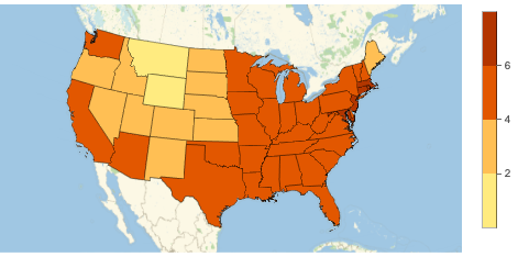
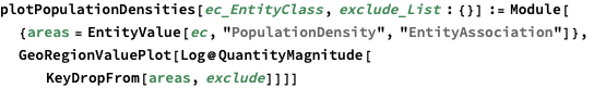
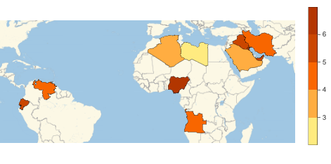
Population density for the continental US states
For a warmup, let’s plot the population densities for the continental US states, which is easy to do as this information is available as one of AdministrativeDivision properties. We can use a convenient EntityValue function, with a proper EntityClass as the first argument, which can be entered by pressing Ctrl+=, typing “us states”, and hitting Enter. You can think of EntityClass as a collection of entities of a particular type.

Since we provided EntityAssociation as a third (optional) argument to EntityValue, the result is an association which maps each US state entity to its population density.
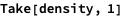

Notice that the population density is not just a simple number, but a number with some magnitude (people per square mile), represented in Wolfram Language by an expression with the Quantity head.


Here, % refers to the result of the previous expression, and FullForm shows how the above expression is stored internally. FrontEnd does a charming job of displaying the entity, quantity, rule, and association nicely.
Having the population density represented as a quantity is very convenient, as we, for example, can convert it into different units:

Before we can display these densities on a heat map, we would need to do a couple of things: first, we want to remove Alaska and Hawaii, and also DC (as it’s a clear outlier). And secondly, we want to apply Log to numerical values, as the difference in densities between a tiny Delaware and a sparsely populated Wyoming is over 60x!
The first task can be done with KeyDropFrom, which drops given keys from association (you can copy and paste the names of the states from the output, or use Ctrl+= again to enter them). The second task can be accomplished by using a combination of QuantityMagnitude, which extracts a numerical value from Quantity, and Log,. Both of this functions are Listable (= can be applied to a list or association without an explicit call to Map), and Map[f, expr] applies f to values when expr is an association. Finally, GeoRegionValuePlot will color the states according to the (log) of their population density:

We can combine the above two steps into a function that, given an entity list of countries or administrative divisions (everything that has a population density property) plots the above. The optional exclude argument can be used to remove certain areas from plotting.

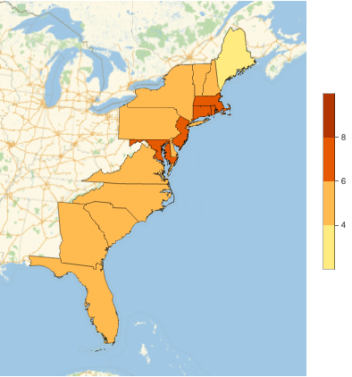

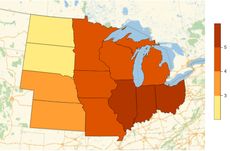
Note that we can also use a collection of countries as an argument to plotPopulationDensities, since each country is an Entity object that also has PopulationDensity property:


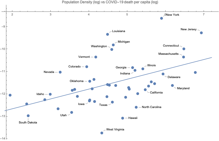
Death rates per capita vs population density
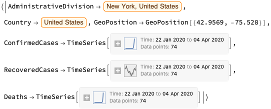
Now for the main dish: we’re going to use the same dataset as in our earlier blog post on this topic, and use the fact that AdministrativeDivision column returned by ResourceData is an Entity object:

Let’s take the first line of this dataset as an example (Normal converts a one element dataset into an association):

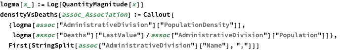
Let’s write a function that calculates two values - population density and COVID-19 deaths per capita. We also wrap these two values into a callout, so that ListPlot can show these labels:

Now we can apply this function to each row of the dataset (we’ll also remove a couple of outliers) and plot the result:

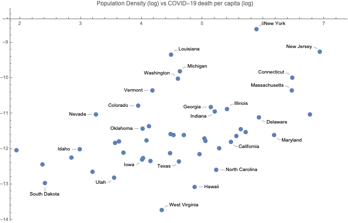
Visually, there is a weak correlation between log population density and log death rate per capita, as we expected. Let’s calculate the R-square explicitly. We can use Cases to extract just the first argument from Callout. There are two more subtle points: we apply N to callouts, which calculates the numerical value to all the logarithms, and we only select cases where the second value is Real, since for Wyoming, that death per capita is minus infinity.


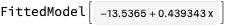
The R-squared is pretty low, though at only 22%:


Finally, let’s plot the fitted line on the chart: