COVID-19 confirmed cases and deaths in the US
Wolfram Research maintains and regularly updates COVID-19 data series in their repository and it provides the US state level data.

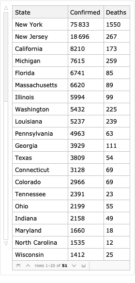
The data is stored in a Dataset, a Wolfram Language’s way to organize and query structured data. It has 51 entries (for 50 US States and the District of Columbia), and tracks the cumulative number of confirmed cases, recovered cases, and deaths for each state by date.

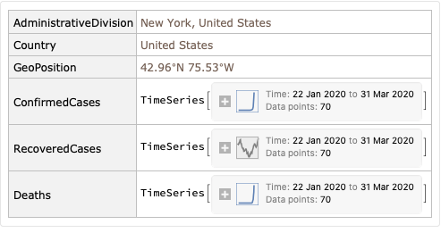
Cases and deaths are stored as TimeSeries, which is a sophisticated way to represent time-value pairs: for example, you can query the TimeSeries object about the first / last date in the series, ask for a value on a particular date (and it will be automatically interpolated if the data point doesn’t exist), etc.


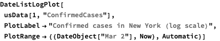
We can plot the number of cases for New York using DateListLogPlot, which makes the Y-axis logarithmic. We also start plotting from Mar 2nd, as there is no interesting data before:
Dataset has a powerful query operator syntax: to quote from the official documentation,
In
dataset[op1, op2, ...], query operatorsop_iare applied at successively deeper levels of data, but any given one may be applied either while “descending” into the data or while “ascending” out of it.
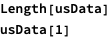
There are many special cases: for example, a single number i is a descending operator which takes part i and applies subsequent operators to it, while "key" similarly takes the value of key in the association. Therefore usData[1, "ConfirmedCases"] takes the first row of the dataset, which is an association with six keys shown above, and then takes the value of "ConfirmedCases" key, returning a TimeSeries.
Here is another example: since we are not going to use Country and GeoPosition fields, we can redefine usData to omit those fields. In this case, All is an operator that applies subsequent operators to every part of the list or association, and <|key1->op1, key2->op2, ...|> applies multiple operators at once to the result, yielding an association with the given keys, and also let us rename the columns.
While we are here, we will also convert state names to strings, since every state returned by ResourceData is an Entity object, not a string, and a combination of StringSplit and First extract just the first part before the comma. We also use /*, which represents a right composition of functions.
Using a helper function that returns the last value for a time series, we can see the latest number of confirmed cases and deaths. Here we used another query syntax: {key1->op1, key2->op2, ...} applies different operators to specific parts in the result.
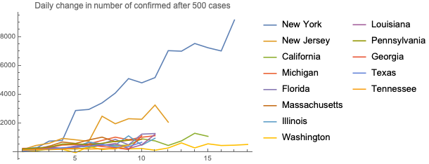
We can now calculate and plot daily growth in number of cases and deaths. To avoid having too much noise in the charts, we will only calculate differences once a state has greater than 500 confirmed cases or 20 deaths. Note the use of a helper function growthAfter and how we use pure functions
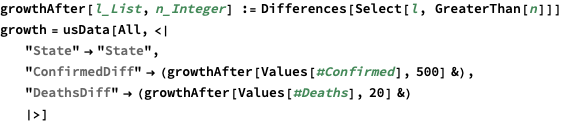
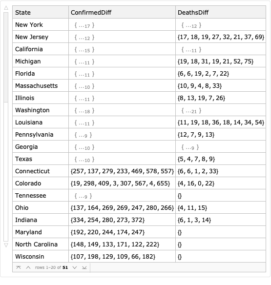
Similarly, we will only plot a data series if it has more than 5 data points for deaths or 9 data points for cases:

Since we want to plot a few similar charts with different parameters, we’ll use a helper function for that:
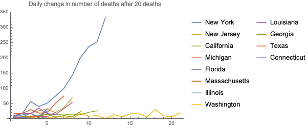
Here is a chart with the number of daily increases for deaths - New York is clearly dominating everything else

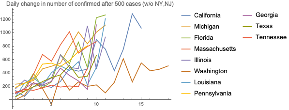
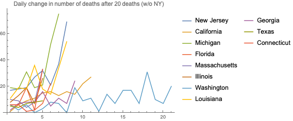
Here is the same chart without New York: California has a recent spike, while Massachusetts remains pretty stable for a long time.

And here is the number of confirmed cases, with and without NY and NJ scale: Washington, which had the first case in the country, and New Jersey have somewhat stabilized, but it can just be a function of how much testing is done at a state level.